

It’s a wonderful moment in one’s career when a scary, thinkably unclimbable, mountainous mound of brain-squishing non-understanding becomes a smiling, welcoming pool of sunshine, understanding, and awe. Yes, I am talking about Salesforce’s Report Builder and my wonderful breakthrough moment while building a joined report.
Looking back, I do understand why I shied away from Report Builder. It’s because I was so in love with other parts of the platform. Because I was focusing my energy and power in areas where I was already successful. Salesforce configuration and automation is not only fun, but very rewarding work. There is a great sense of accomplishment when a workflow or process that you’ve been building flows like a charm. You can’t wait to show it off to coworkers and clients. I feel like a proud Mama whose kid just hit the game-winning home run in those moments. So when it came time to build a report, or worse yet, a dynamic dashboard, I’d get nervous because I was entering the unknown part of the platform that I didn’t yet understand.
Spoiler Alert: I fell in love with Salesforce’s Report Builder while making a joined report. Here’s how it went down:
The Task
A client needed a report that showed open Cases at the beginning of the week, Cases opened this week, Cases closed this week, and open Cases at the end of the week. It sounds so simple, right? Well it became MORE simple once I figured out that this wasn’t going to be ONE report. It was going to be multiple reports.
Even though I didn’t yet know how to build what I was looking for, there were some parts of Report Builder that I already loved. I love that I can drag a field into the filters pane. Easy and quick filtering? Yes, please! I love that I can filter using words I understand like “this week,” “true,” “last 7 days,” etc. I love that I can un-show details in the preview pane to get a global perspective of my report. The list goes on.
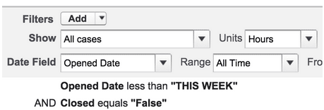
The first 3 aspects of my task were easy enough. I created 3 reports. My first report listed how many Cases were open at the start of the week. I set my filters to ‘Opened Date is less than this week,’ and ‘Closed equals false.’ Boom.
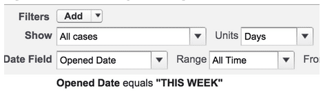
My next report was for Cases that were opened this week, so I set my Date Field filter to “Opened Date” and the Range filter to equals “this week.”
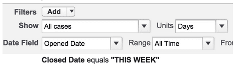
And then I did a report for Cases closed this week, with my Date Field filter set at “Closed Date” and the Range filter set at “this week.”
In 5 minutes I was three quarters of the way there and feeling confident…except that this last report was starting to make me scratch my head. In order to get number of Cases open at the end of the week I needed to do some math. I needed Cases open at the beginning of the week, plus Cases that were opened this week, minus Cases that were closed this week. It all sounds so simple, yet I couldn’t think of a way to translate that into Report Builder.
That brings us to Part II:
The Breakthrough
By the time you pass your Salesforce Administrator exam, you know the difference between Tabular, Summary, Matrix, and Joined reports. You can answer just about any multiple choice or true/false question regarding these 4 report formats. However, that doesn’t mean that you’ve actually CREATED all these types of reports. I did a quick search at help.salesforce.com and brushed up on what adding a block to a joined report will do. I very quickly realized that I was absolutely on the right track. I created 3 blocks in total and used the filtering I had used on my 3 previous reports to these blocks. Then I added a cross block formula to my last block. Oh, how I love you, cross block formula.
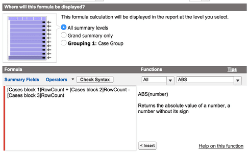
In the formula, I did my simple math calculations (count of block 1 plus count of block 2 minus count of block 3), and voila! Now I had a report that showed how many Cases remained open at the end of the week.
The best part about all of this is that I completely understood what I did and why it needed to happen the way it did. And, just in case you’re wondering, the answer is “Yes.” I immediately shared my beautiful joined report with a coworker. I felt like a proud Mama again. But this journey was far from being over. As I mentioned above, our client wanted this to be ONE report, and I had many. The solution? A beautiful, dynamic dashboard. Check out my blog next month to see how I tackled that not-so-scary battle.